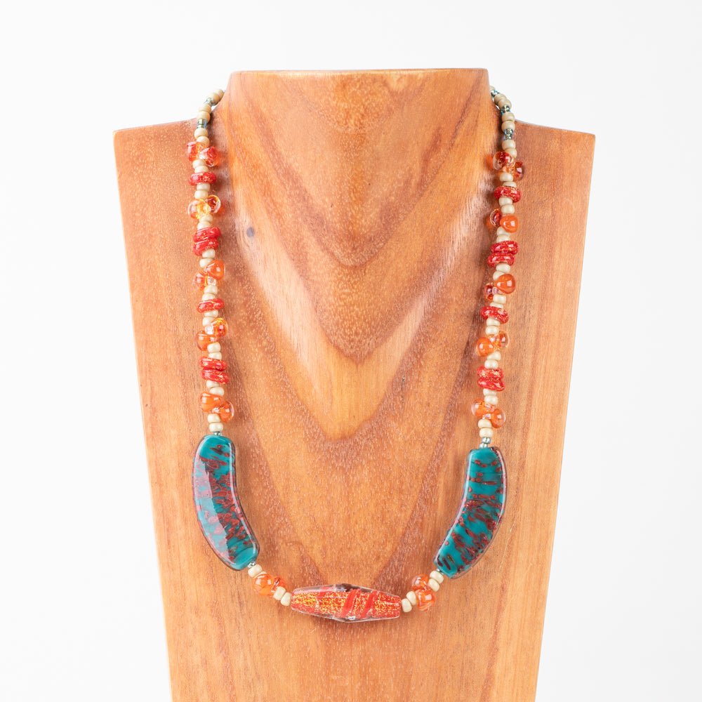
Color pairing is one of the most common challenges in beadmaking. With so many beautiful beads available, it is easy to feel overwhelmed when trying to decide what actually works together. The good news is that successful color combinations are not random. They follow a few simple principles that anyone can learn.
This guide breaks color pairing down step by step so you can build bead palettes with confidence, whether you are just starting out or refining your design process.

Step 1: Choose a Hero Color
Every strong color palette starts with one main color. This is your hero color. It sets the tone and emotional direction of the piece.
Ask yourself what you want the design to feel like. Calm, bold, earthy, playful, dramatic. The answer usually points directly to your hero color. Once you choose it, everything else should support it rather than compete with it.
Avoid picking multiple hero colors at the beginning. One clear lead color makes the rest of the decisions easier.

Step 2: Add a Supporting Color
Next, choose one supporting color. This color should work with your hero, not overpower it.
There are two reliable approaches here. You can choose a color close to your hero on the color wheel for a smooth, cohesive look. Or you can choose a color across from it for higher contrast and visual interest.
When in doubt, keep it simple. One hero and one support color is often enough.

Step 3: Introduce a Neutral
Neutrals are what give a palette breathing room. They prevent designs from feeling busy or overwhelming.
In beadmaking, neutrals are not limited to white or black. Clear beads, soft greys, creams, smoky tones, or muted versions of your hero color all count as neutrals.
This step is especially helpful if you are working with bold or saturated colors. A neutral helps anchor the design and gives the eye a place to rest.
Step 4: Check Light and Dark Balance
This is one of the most important steps and one that is often overlooked.
Before committing to a palette, make sure you have contrast in value. That means at least one lighter bead and one darker bead in your combination. Without this, colors can blur together once strung or worn.
Lay your beads out and squint slightly. If everything blends into one tone, add either a lighter or darker element until the design has definition.
Step 5: Control Color Intensity
If your palette feels too loud, the issue is often saturation, not color choice.
Try swapping one bright bead for a softer, dustier version of the same color. This reduces visual noise without changing the overall palette.
If the design feels flat, you can do the opposite. Add one brighter accent bead to bring energy back into the piece.
Small adjustments in intensity can completely change how a palette feels.

Step 6: Create Depth with Finish and Texture
You do not need more colors to make a design interesting.
Mixing finishes adds depth and dimension even within a limited palette. Combine opaque beads with transparent ones. Mix glossy with matte. Use luster or metallic beads as subtle highlights rather than focal points.
This approach keeps palettes cohesive while still feeling rich and layered.
Step 7: Test Before You Commit
Before stringing an entire piece, do a quick test.
Lay out a short repeat using your hero color, supporting color, and neutral. Step back and look at it from a few feet away. If the hero color still leads and the other beads feel supportive, the palette works.
If something feels off, adjust one element at a time rather than starting over completely.

A Simple Way to Practice Color Pairing
One of the easiest ways to build confidence with color pairing is to work within pre curated palettes. Seeing how colors are balanced together helps train your eye over time.
Shopping beads by color or starting with premade bead tubes allows you to compare tones side by side and understand how small differences affect the final design.
As your confidence grows, you can begin mixing palettes and building your own color stories from scratch.
Final Thoughts
Color pairing is a skill, not a talent. The more you practice, the easier it becomes to trust your instincts and make intentional choices.
Start simple. Focus on one hero color, balance light and dark, and use finish to add depth. With these fundamentals in place, your bead designs will naturally feel more cohesive and polished.